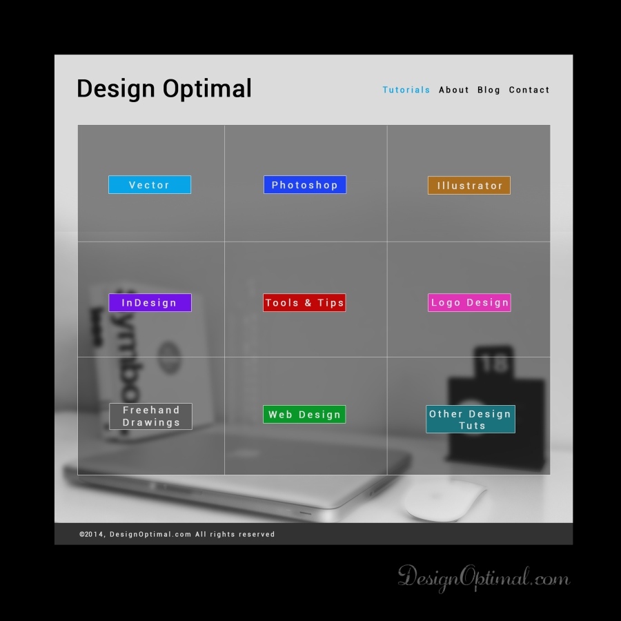
Today we are going to show you how to create a simple home page design for a web site using Adobe Photoshop.
The web page is simple but yet cool so it’s good to start to create some web pages of your own.
Step 01
- Open Adobe Photoshop and create a new document of 1600px x3000px, and make it a Landscape mode save it as Homepage.psd. Make sure you will always keep the Ps grid on ( Ctrl+” ) in order to make the webpage in pixel perfect. Do not mind the height of the document yet because if the height is more than the design that we are doing then we can crop it in the end of the design.
Step 02
- Now we have to use a background image for the web site. We have used an image called Bg_image and placed it as the background of the web page as shown in the next reference image.
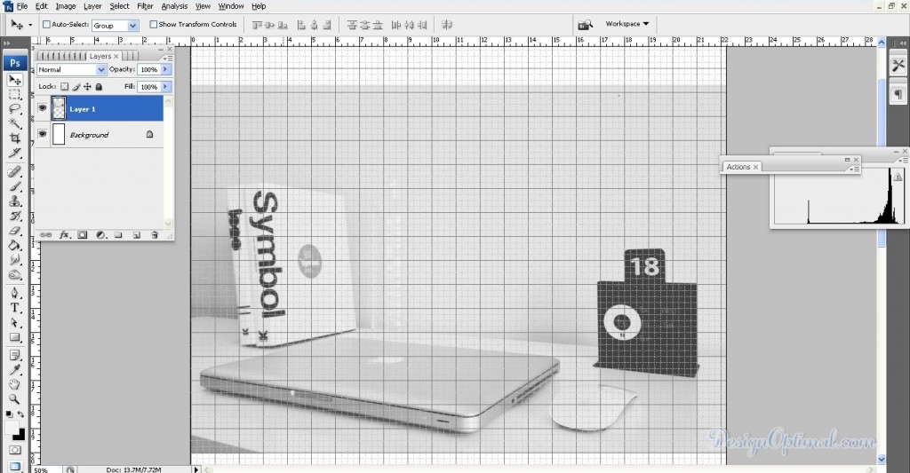
Step 03
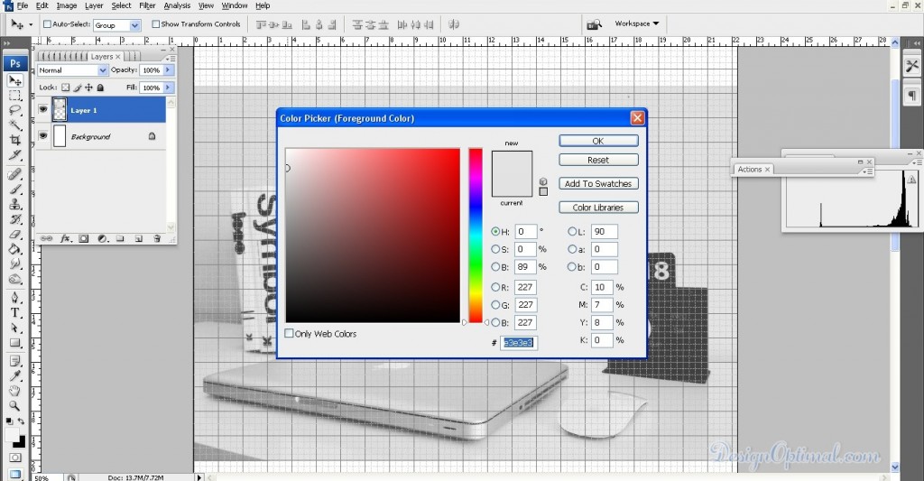
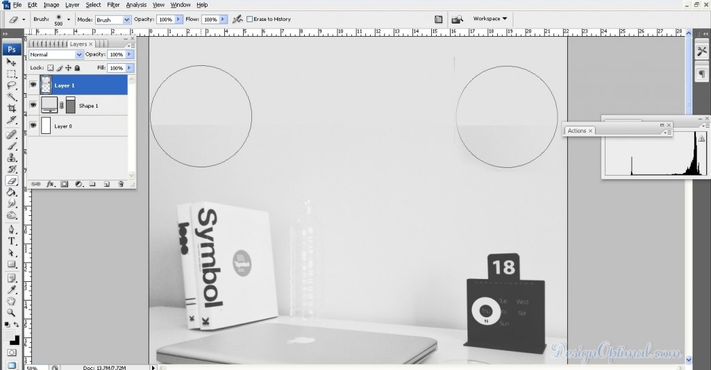
- Now in the top, there is an empty part where the background color can be seen. So we will fill it up with a light grey color that has been picked from the top area of the background image and use it to fill that blank space ( #e3e3e3). Now drag the layer below the layer with background image and erase off the top area of the background image. Now it looks like the background image is filling the whole area.
Step 04
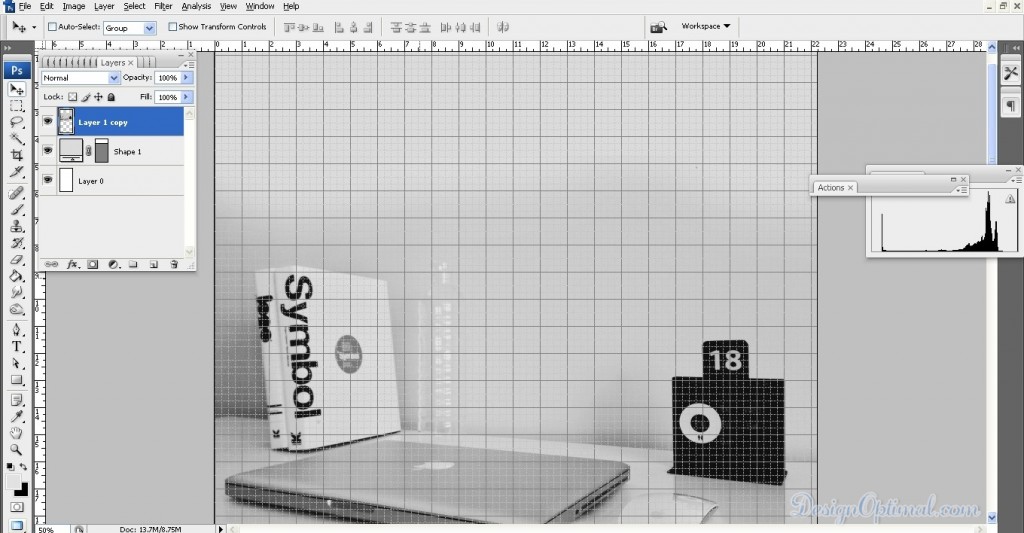
- Now select the background image and the layer with the gray color, fill and merge them in to a single layer and duplicate it. Then make the blending option in to multiply, this will make the background of the web page more eye catchy.
Step 05
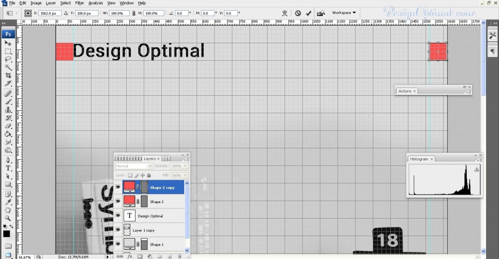
- Now for the next step we are going to add the logo of the site design optimal .com, for this I used the font called Roboto. It’s a stylish and elegant font that can be used in most of the designs. The font size is going to be 75px. When you are adding this logo make sure that you keep a 50px gap from the starting point of the document, and do the same of the end point of the document when you are adding the content to the web page.
Step 06
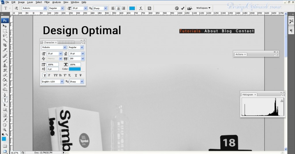
- Now we are going to add a simple navigation to the top of the page it’s mainly going to consist of
- TUTORIALS | ABOUT | BLOG | CONTACT
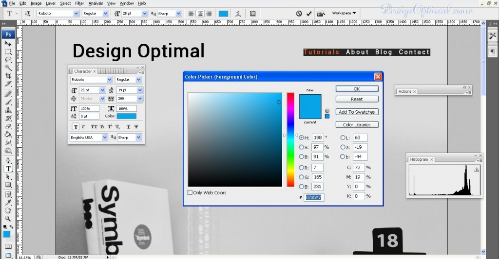
- now make the font size around 25px and use the same font called Roboto that we used to the main logo. Keep this text layer 50px away from the end point of the web page. Now got to Character pallett and make the spacing between Character 200pt .
- now the main attaraction of our site is tutorials, so I thought of keeping it selected in the beginning. So I have used a solid Blue colur to make the tutorial text stand out of the rest of the navigation text. The color code will be # 07a5e7.

Step 07
- Now to add the content to the body area. This will be mainly consisting about the tutorials categories of our site those will be
Vector | Photoshop |Illustrator | In Design |Tools & Tips| Logo Design| Freehand Drawings |Web Design
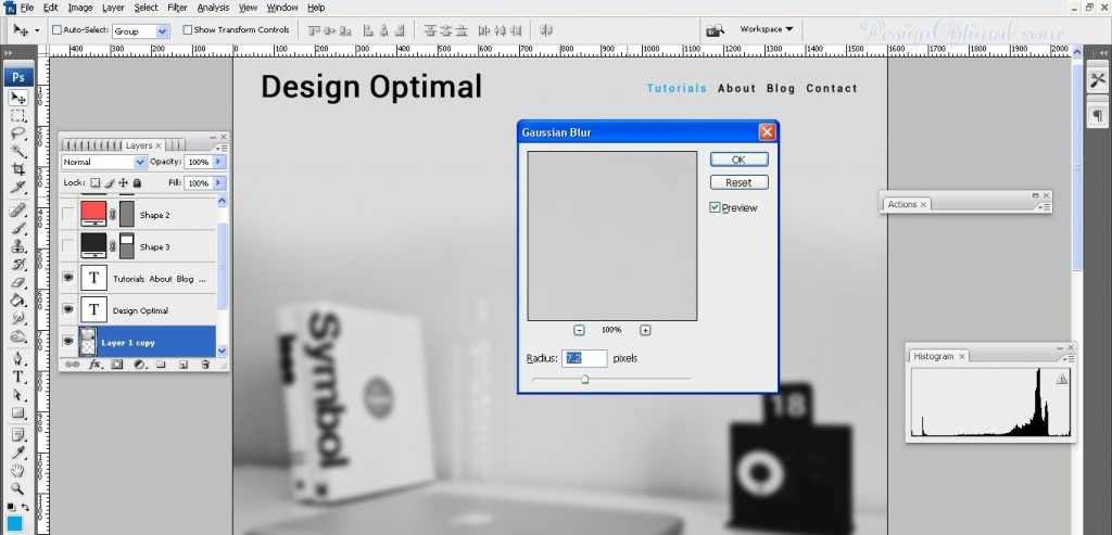
- Now before we add this content we have to make the background image bit blurred, that we created in the first steps .so I have add a blur of 7.2px . To add Gaussian blur go to Filter>Blur>Gaussian Blur.
Step 08
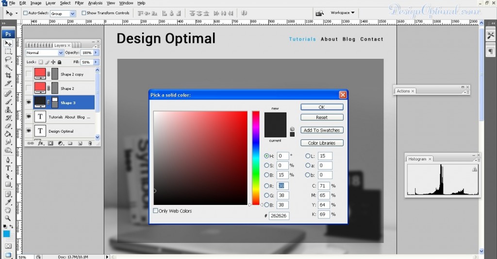
- Now to add a rectangle shape in the middle of the body of the web page. The categories of our tutorials will be coming on top of this rectangular shape. The background color will be # 262626. Now reduced the opacity of the layer for around 50%.
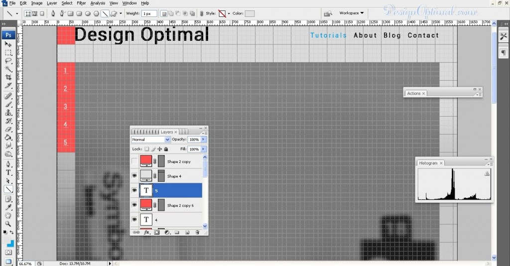
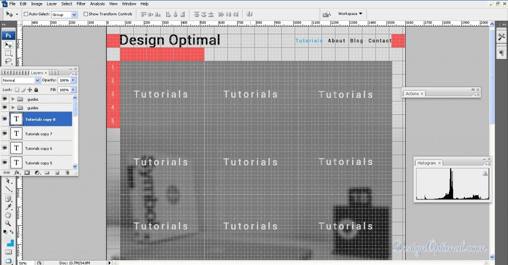
- Now to separate the categories with the stripes. Now when we are going to add stripes we will be adding 1px stripe for every 5 rectangle pieces of the grid that we are having in top of the web page. It will look like the reference image that is shown below. Now repeat it again so we will be having two 1px lines across the background rectangle.
Step 09
- Now do the same with width area of the rectangular image, add 3 lines of 1px line across the width area. After that, start adding the Categories related to the site. Those will be
- Vector
- Photoshop
- Illustrator
- In Design
- Tools & Tips
- Logo Design
- Freehand Drawings
- Web Design
- Other Design Tuts
I will be adding those like shown in the next image. Every time you type the categories of the site, make sure you make them center to the all 9 rectangle shape that has been created by the 1px lines.
Step 10
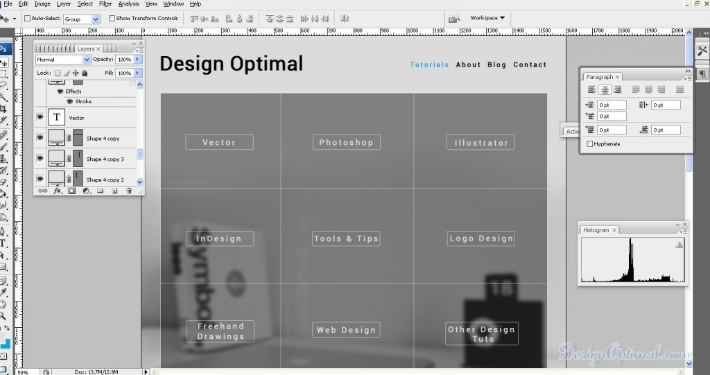
- Now reduce the font size of the categories for around 30px and add a bounding rectangle around the text with a 1px stroke without a background fill. It will make the categories text catchier. See the reference image below. Every time you use the bounding box around the categories text, make sure you center it to the text and do the same to the main grey color rectangle we created early.
Step 11
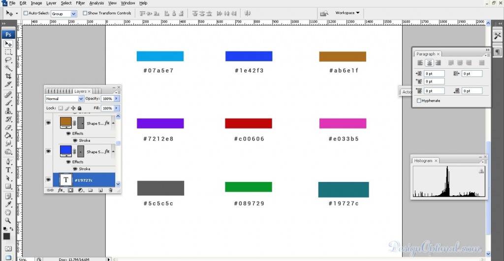
- Now to add some color to the bounding box so we can recognize each category at a glimpse. This will make each category different from the other. So we know from the applied color which categories are we going to select or we are in. I have shown the colors that I have used in the bounding box in the below image.
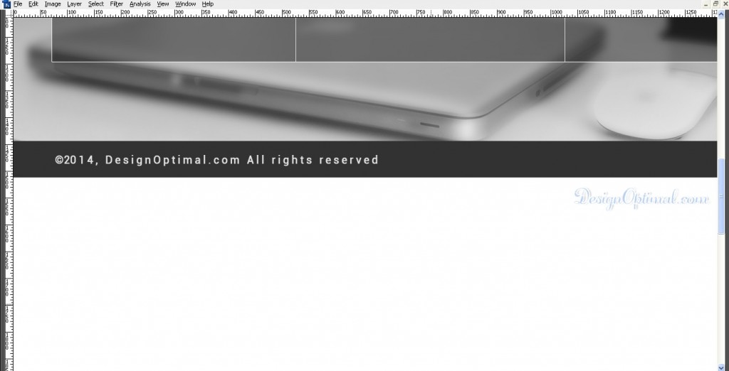
- Now add the bottom area with the credits. I’ve drawn black box # 323232 color and typed ©2014, DesignOptimal.com All rights reserved. See the reference image below.
Step 12
- Now we have got ourselves a simple web home page design. If you need you can have more details for the categories like rather than having a bounding box with colors, we can add a icon or a vector image related to each categories. If you need you can have a different font, different background image, it all up to you and your creative point of view.
So for the final step take the crop tool and crop the web page after the place where we add the bottom credits.
