Hello everybody there!! Today we are going to show you how to make a Simple web site design using Adobe Photoshop. For this tutorials we designed it for a fitness website.
Web site designing is a popular Job in the Graphics and UI design Industry as you can create a web site from a small shop to a Huge Supermarket. Basically if you have got the info and the creativity you can come up with a web site concept for any kind of industry, a person or any kind of services or item.
The design process can be showing in simple steps like, first you have to gather the info about the type of web site that you’re going to create and get the client’s likeness about the web site look and feel. Next, you have make some research on the web about the industry or type of web of similar web site that have been done by designers. Next you will make the prototype design basically the home page design like scratch and get the client’s feedback and based on the client’s feedback and your creativity you will have to complete the design.
Resources (all credits goes to original authors)
- Fonts Used :
- Images used :
Step 01
- Open Adobe Photoshop and open the grid only.psd that has been supplied.
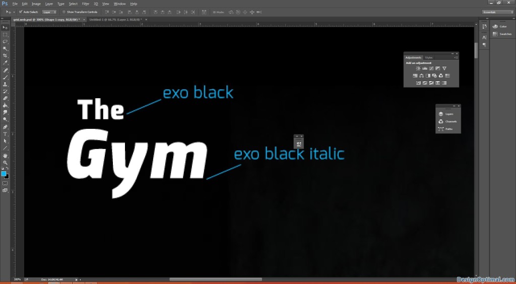
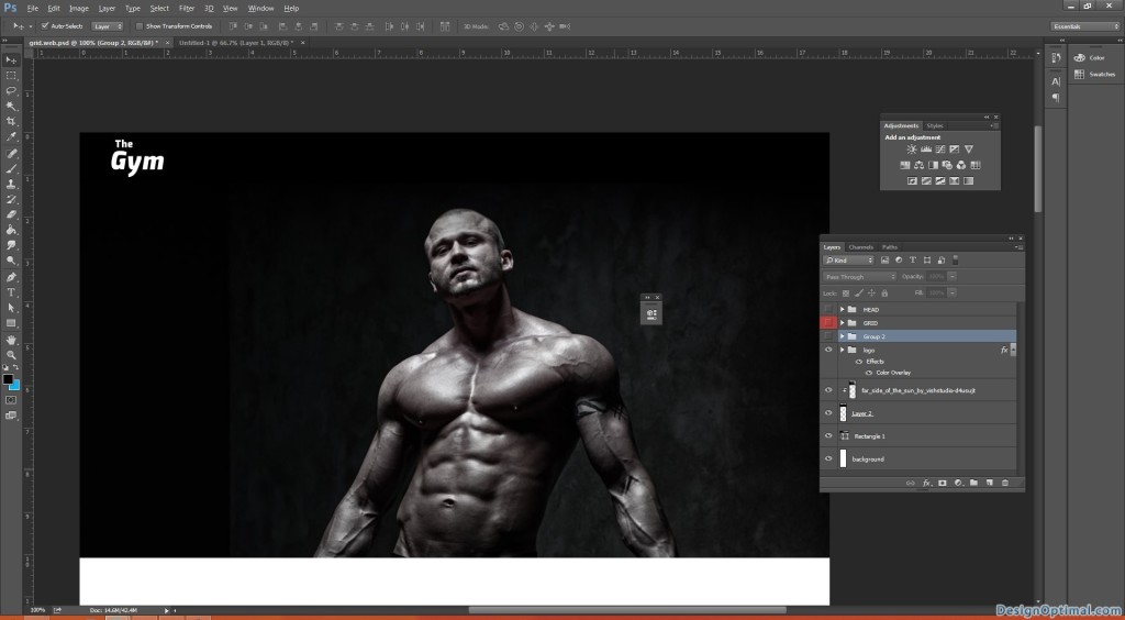
- As the first step we will have to make a fake logo to the Web Site.
- I used the Exo Black Italic and Exo Black fonts to the logo and typed as “The Gym”.
- Now when we make a web site, we will have to place the logo and the main navigation on the top of the web site.
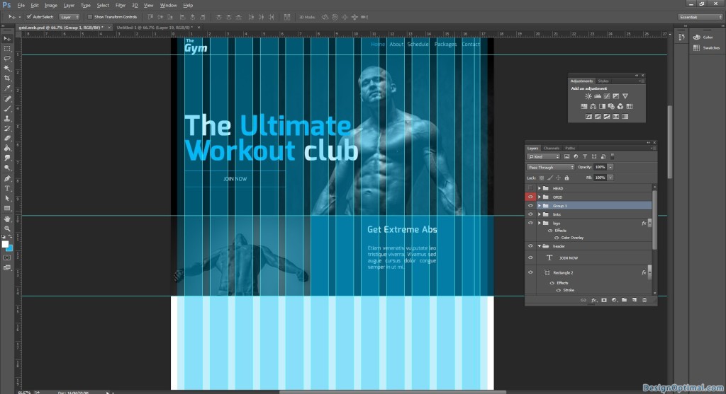
- Next, when making the main banner, always we will have to make the banner to be shown in the first scroll area.
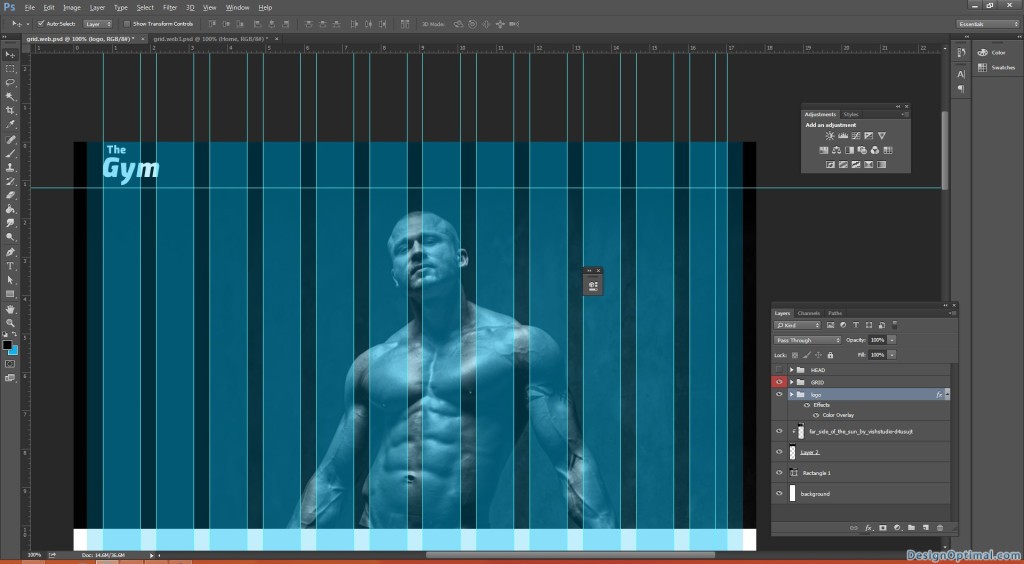
- The main header area the width should be the width of the web site and in this case it is 1280px and the height should be 640px.
- We will add the far_side_of_the_sun_by_vishstudio-d4usujt image as the header.
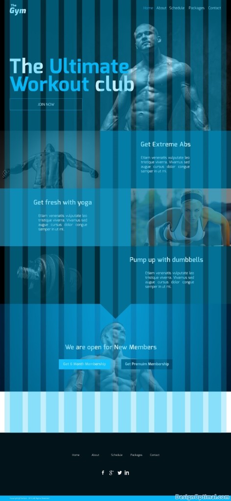
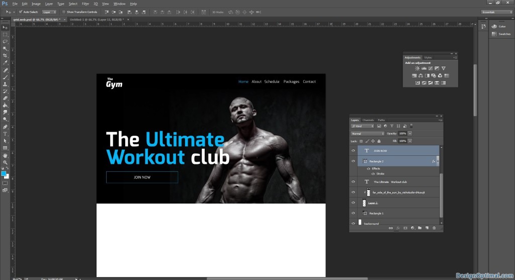
- The steps that we have completed so far will be like shown below.
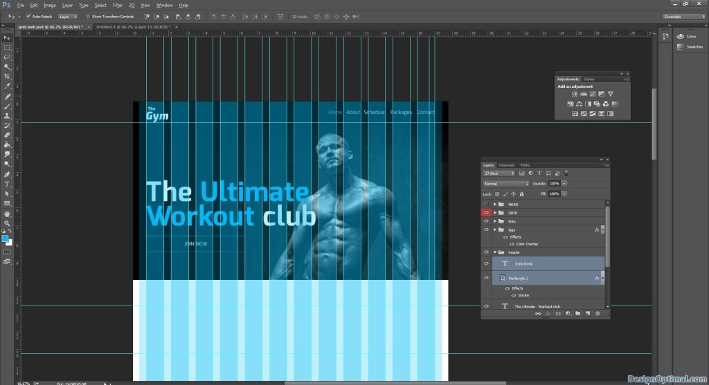
- Always remember to keep the content in the grid area as the grid has been implemented to keep the designers and the developers both in the correct path. Sometimes when the designer makes a design there are mostly times that the developer can’t implement the design as it is, so when we use the grid correctly, it’s always easy to make the same design to the HTML when developing.
Step 02
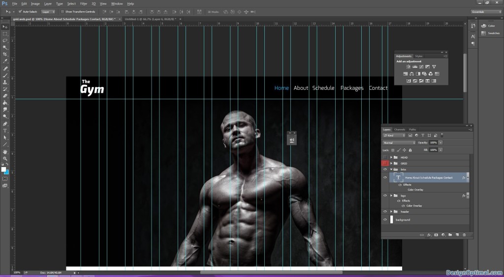
- Next we will move into the main navigation.
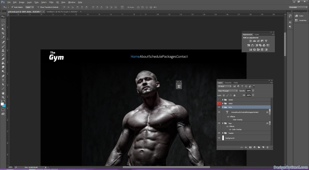
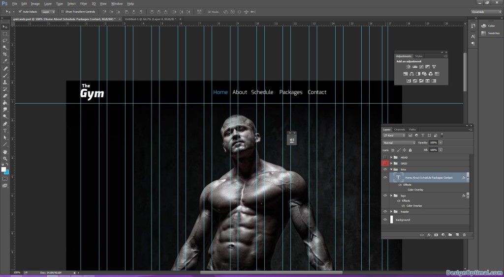
- The navigation will consists with the main links such as, HOME|ABOUT|SCHEDULE|PACKGES|CONTACT high light the home link in light blue.
- Remember when we type the links the we need some space between the main links, so when adding the links if we press tab once it will add a space of 5px between a text if we press Shift+Tab it will add 10px between the text.
- If you feel like adding a space of your own between the texts, make sure to copy the space between the first 2 links and add it to the other links as well.
- So here we will add 10px space between every link because there is no lot of links on the top.
- Make sure every time whenever you are working on a new content of the web site, group it and name it. Because it is easy to make changes and it’s easy to developer to find the design elements whenever he needs them.
- Make the main links right aligned, that means to keep far end corner of the right side of the grid.
Step 03
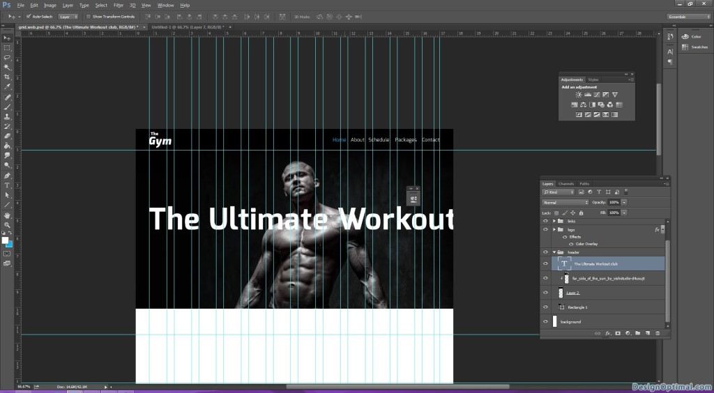
- Next we will have to add caption to the Main header so here I thought of adding the caption as “The ultimate workout club”.
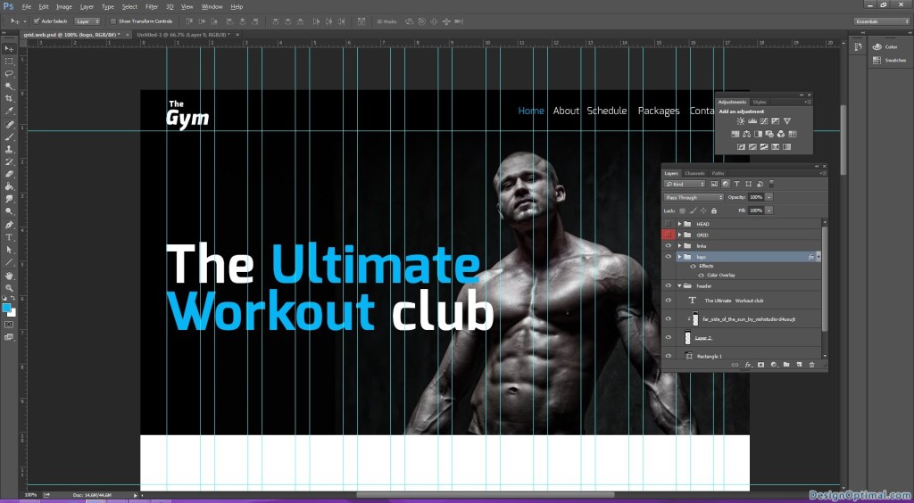
- Make the ultimate workout part highlighted with blue color.
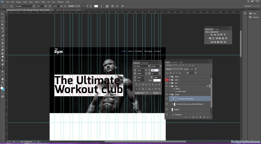
- The font size will be 120px always remember to keep round figures when typing the font don’t keep decimals (Ex: not 120.18px but 120px).
- So after I typed it, I found out the font size is clashing with the main image so I made the font size as 110px and I moved the main image to the right side of the grid.
- As the next step we will have to add a clickable box below the main text as Join now.
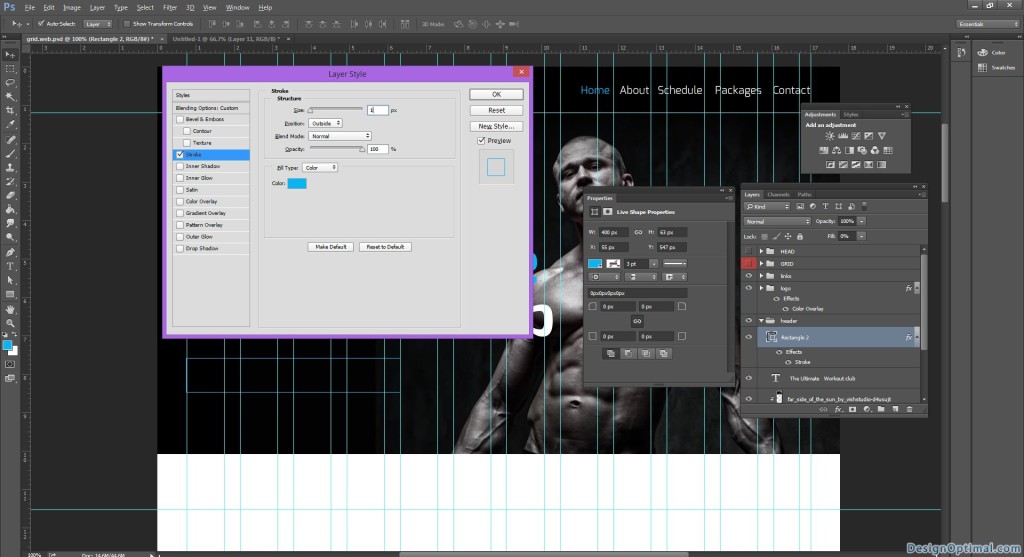
- So we will have to make a rectangle shape using the shape tool but keep only the stroke remove the fill and in the middle of the box type as join now with the same font.
- Keep the stroke as 1px and blue.
Step 04
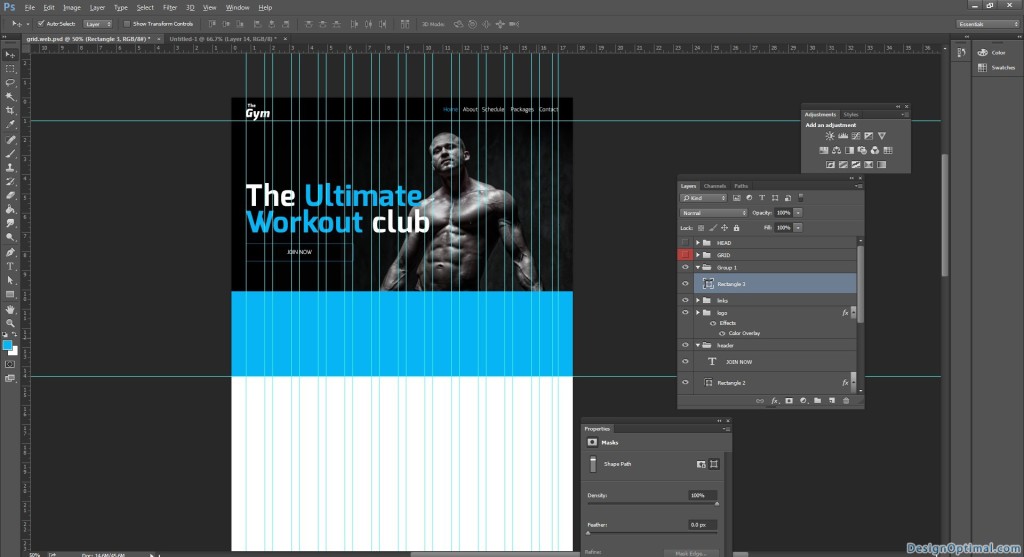
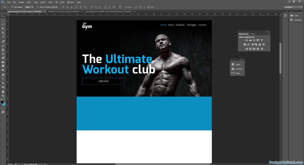
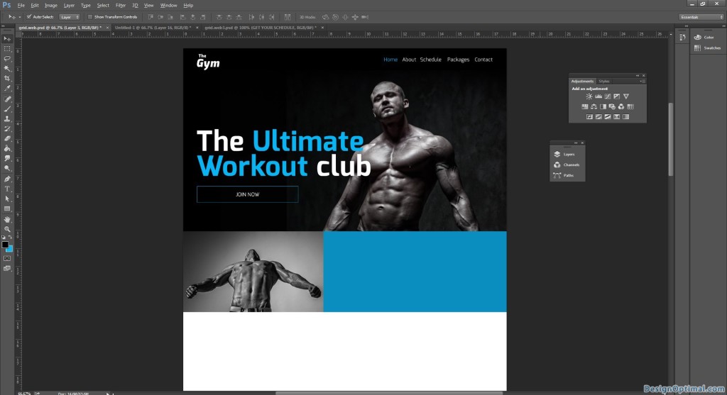
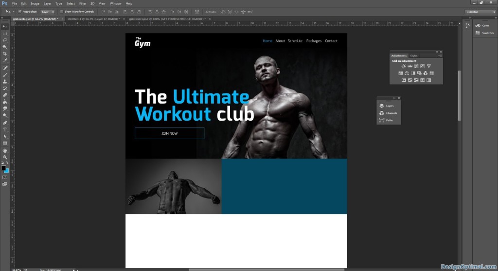
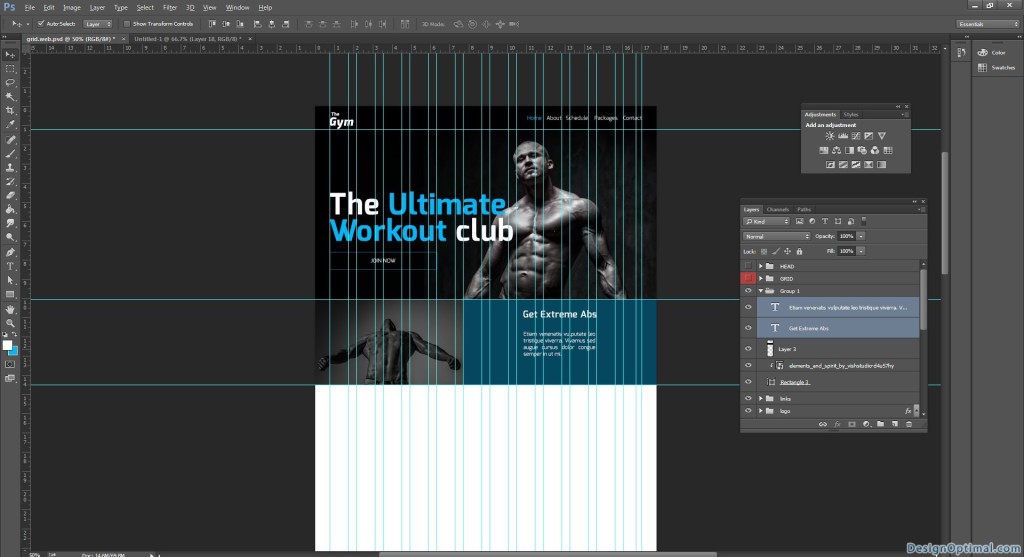
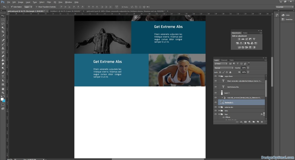
- Next we will add some elements related to this. These will be some banner type images so we will keep them half the main header height to them so it will be 320px each.
- The first banner will be about Abs exercises. We will add a caption as Get Extreme Abs.
- And we will add the image named as elements_and_spirit_by_vishstudio-d4u57hy as shown below.
- Next as the same width and height, add a shape and fill with black fill and next reduce the opacity to 50%.
- Next add some dummy text, you can get dummy text from lipsum.com.
- Center the text to the blue fill that is next to the image area.
Step 05
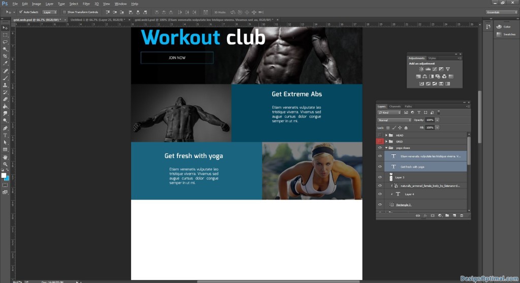
- Next we will duplicate the banner and change the positions.
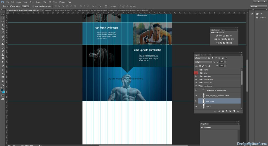
- This will be about yoga classes.
- So we will use the image named naturally_armored_female_body_by_fatenano-d799bwias.
- Add the text as get fresh with yoga.
- Add some dummy text as before.
- For this fill shape select a different blue color as the fill I used #34c8ff.
- The steps are shown below.
Step 06
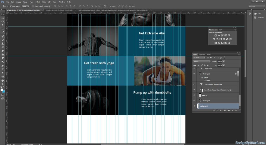
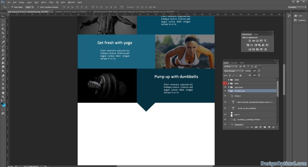
- Next we will duplicate the first banner and make the text as pump up with dumbbells.
- Add dummy text.
- Add a different blue shed for this background.
- The steps are shown below.
Step 07
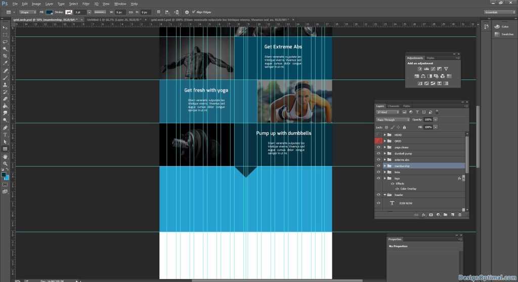
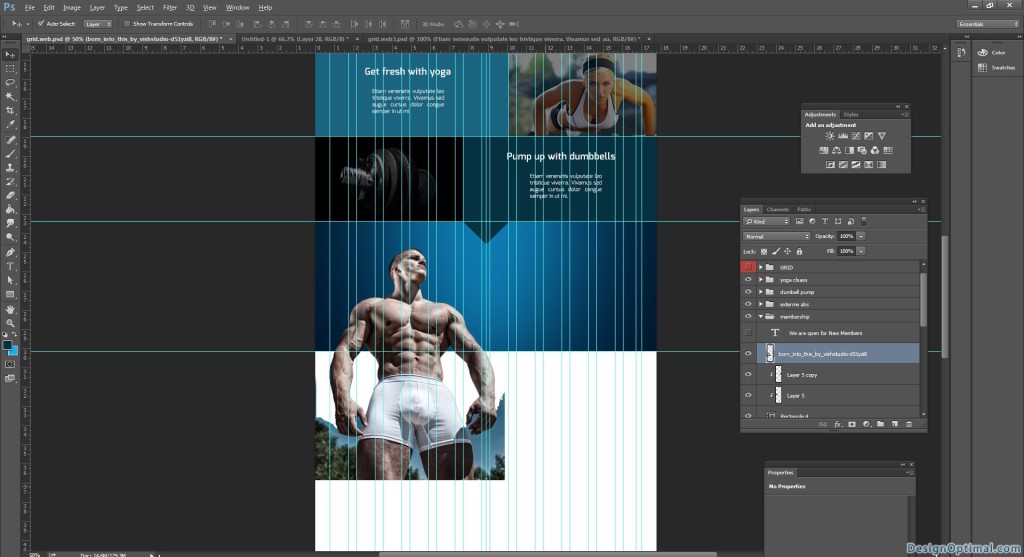
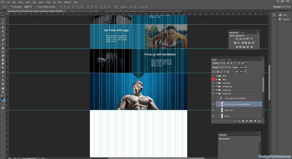
- As the next step we will add a caption about the Gym membership.
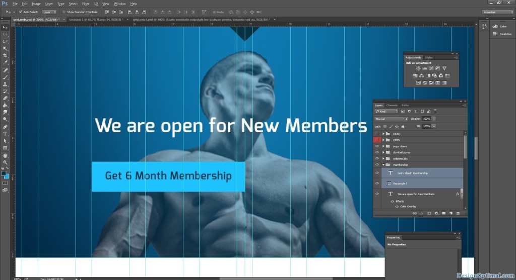
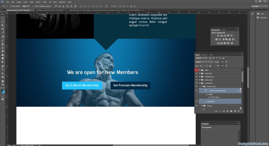
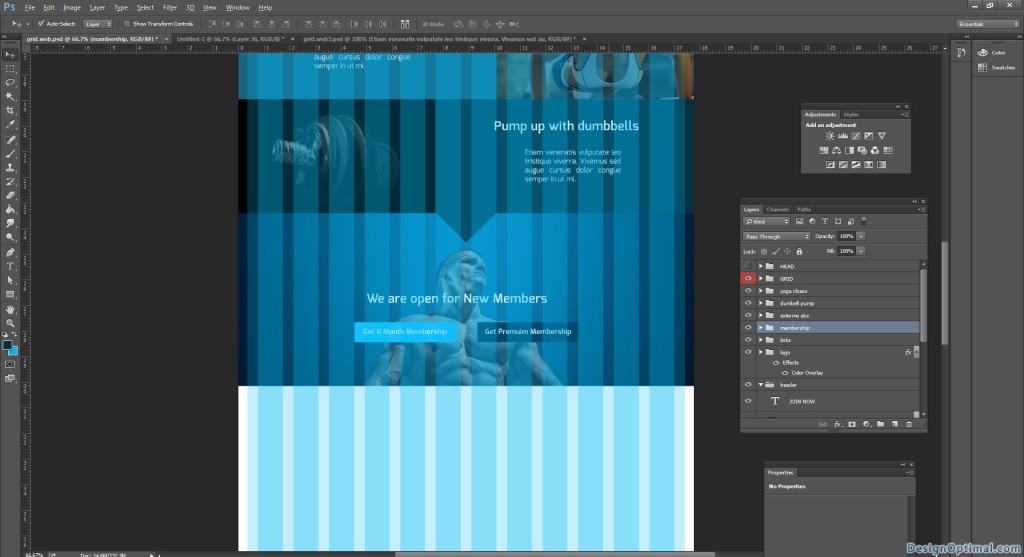
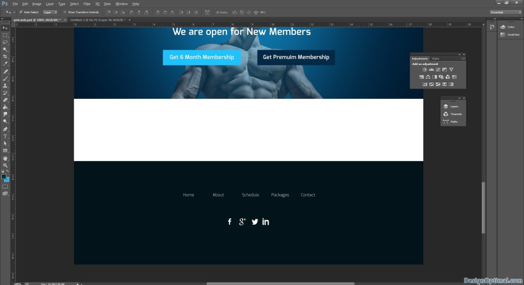
- So we will add a text as we are open for new members.
- Keep two buttons to choose to people who visit the site as get six month membership /get premium membership.
- For the background image we will add born_into_this_by_vishstudio-d51yzi8 image and reduce the opacity to 50%.
- The steps are shown below.
Step 08
- Finally we come to the bottom area of the web site we will be having same links that we had on the top.
- And if the site got the social media links, we will add them too.
- Finally in the boot we will have the copyright links.

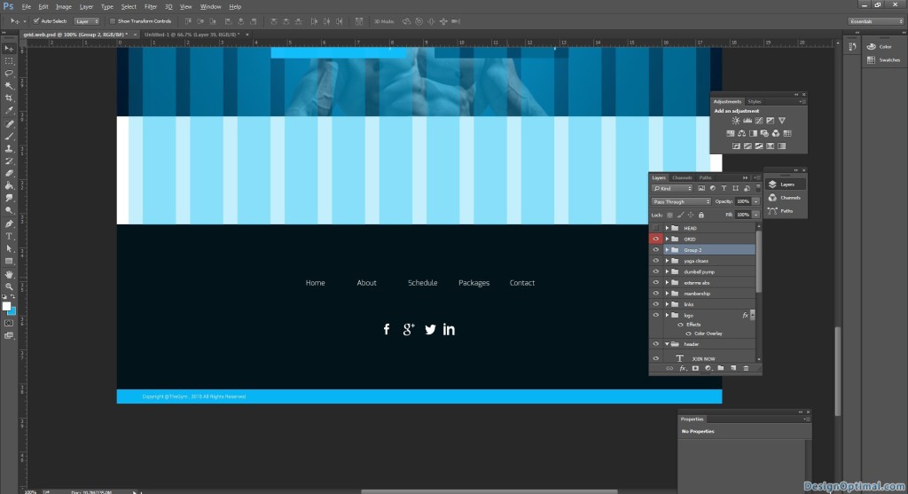
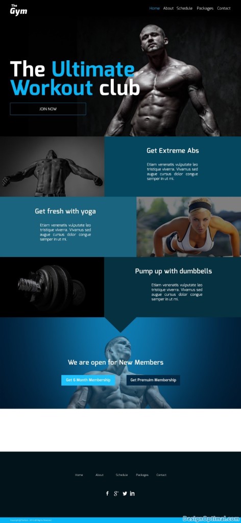
- The final outcome would be like this now.
